kernel function的核心是,只要我们对整个空间给定一个对距离相关性的度量标准,那么我们因为这个度量标准可以推测出别处的数据(可能的)分布。
机器学习里的 kernel 是指什么? - 知乎 https://www.zhihu.com/question/30371867
Preliminary
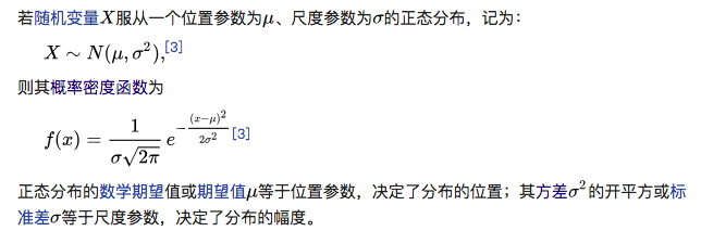
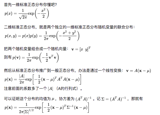
高斯分布
一元高斯分布
- 定义
$Var(X)=E[(X-E(X))(X-E(X))]$
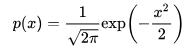
标准正态
二元高斯分布
- 定义
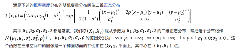
其中,$\rho$是变量$x$和$y$的协方差,$\rho=cov(x,y)=E(x-E(x))E(y-E(y))$.
边缘概率密度
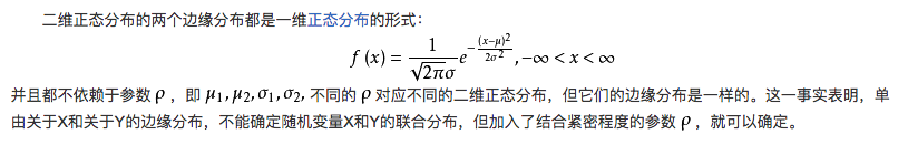
独立性
对于二维正态随机变量$(X,Y)$, $X$和$Y$相互独立的充要条件是参数$\rho=0$.也即二维正态随机变量独立和不相关可以互推。
多元高斯分布
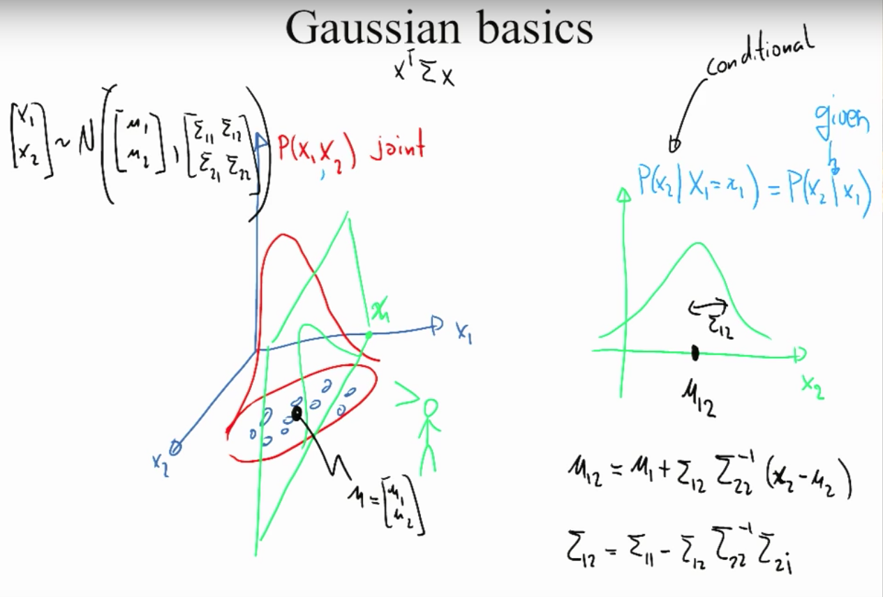
多元高斯下的条件分布
整体服从多维高斯分布,条件分布也服从相应的正态分布,并且均值和协方差矩阵可以被唯一确定表示。
下图以2元高斯分布为例,$x_1$和$x_2$服从联合高斯分布,给定$X_1=x_1$,那么$P(x_2|x_1)$服从高斯分布。
Applications
Gaussian Process Regression
问题理解:你不知道函数长什么样。但是你有一些样本,还有这些样本的函数值(带噪声)。高斯过程可以通过kernel距离,给你把这个函数补出来:给一个新的样本,高斯过程可以告诉你函数值是多少。
Intuition
假设我们有3个样本点及其函数值:$(x_1,f_1)$,$(x_2,f_2)$,$(x_3,f_3)$.我们假设没有噪声,则$f(x)=wx$,高斯回归的关键假设是:给定一些$X$的值,我们对$Y$建模,并这些$Y$服从联合正态分布,故:
那么我们关心的是如何计算协方差矩阵,即如何衡量两个点之间的相似度?为了解答这个问题,我们进行了另一个重要假设:如果两个x 比较相似(eg, 离得比较近),那么对应的y值的相关性也就较高。换言之,协方差矩阵是 X 的函数。(而不是y的函数)。我们借助核函数来计算协方差矩阵,采用常见的高斯核函数:
可以看到核函数中有个超参数$\lambda$,我们可以通过极大似然法求出。
现在我们有了一个新的点$x^$, 我们使用回归方法去预测其对应的函数值$f^$.
我们假设 $f^*$和 训练集里的$f_1,f_2,f_3$同属于一个 (4维的)联合正态分布!
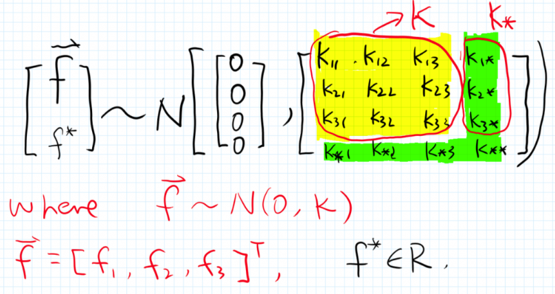
首先,黄色部分是训练集的3维联合分布计算得来的,绿色部分是由预测点$x^*$与训练集求解出来,
这样整个联合分布就可以知道了。又正态分布的条件概率也是正态分布Ref,即$P(f*|f)$为:
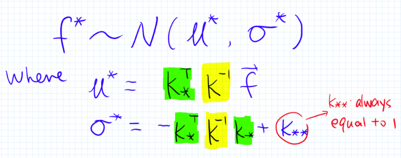
所以这是一种贝叶斯方法,和OLS回归不同,这个方法给出了预测值所隶属的整个(后验)概率分布的。再强调一下,我们得到的是$f^*$的整个分布!
- 高斯分布是针对向量,而高斯过程是针对函数的;给定均值向量和协方差矩阵,我们可以确定一个高斯分布,同样给定一个均值函数和协方差函数,我们也可以惟一确定一个高斯过程。
Definition
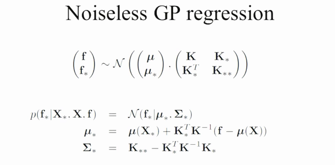
Noiseless GPR
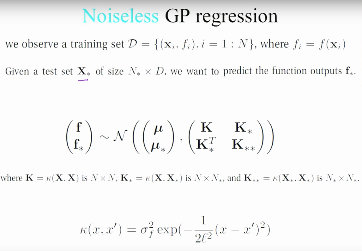
可以看到,kernel中有两个超参数$\sigma_f$和带宽$l$。
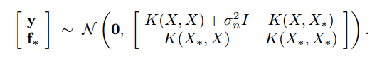
Noise GPR
当观测点有噪声的时候,即$y=f(x)+\epsilon$,其中$\epsilon \sim N(0,\sigma^2)$,那么我们的高斯过程回归:
那么条件概率的高斯分布的均值和方差为:
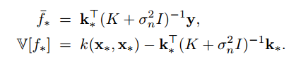
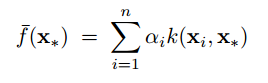
可以看到,均值函数就是观测点值得线性组合;同时,如果令$\alpha=(K+\sigma^2_nI)^{-1}y$,又可以看做是多个核函数的线性组合,
分析:知乎1
Python实现
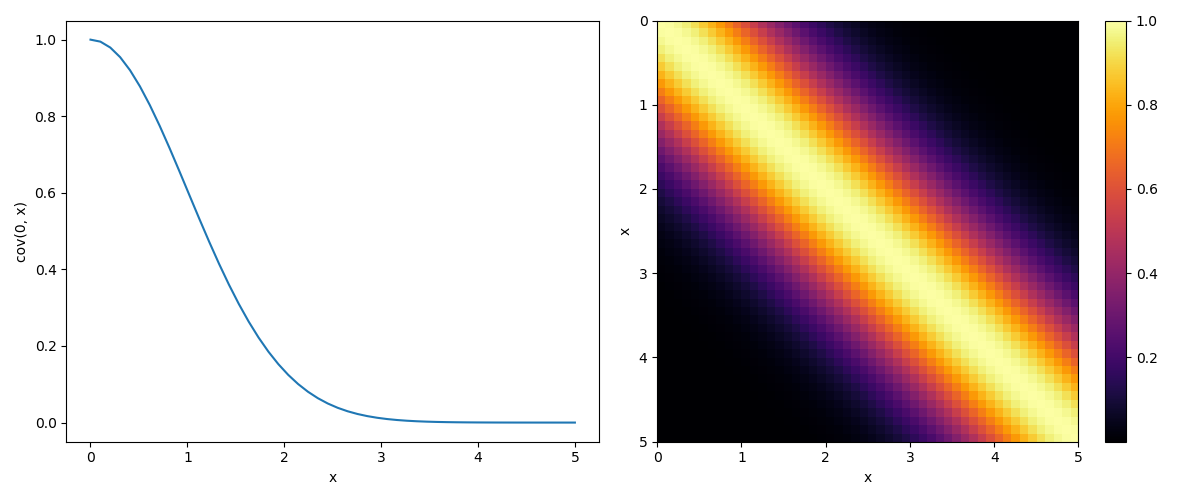
首先定义一个kernel函数来计算数据点之间的协方差矩阵,我们使用squared exponential,$\theta_1$和$\theta_2$是两个超参数,这样越靠近的两个点,它们的kernel函数值也会越接近于1。
|
|
可视化协方差矩阵
|
|
定义好了kernel函数之后,我们便可以利用kernel由样本点求出未知点的函数值的分布,我们假定未知点和已知点共同构成多变量的正态分布,而且多变量的正态分布的条件概率也是多变量正态分布,
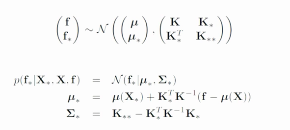
所以只要根据上述公式计算出新分布的均值和协方差矩阵,那么我们就知道了未知点的多变量正态分布。所以,我们现在计算均值和协方差矩阵,可以看到它们两个都是由$K$, $KK_$, $K_K$和$K_$组合而来,所以根据kernel_function来计算:
|
|
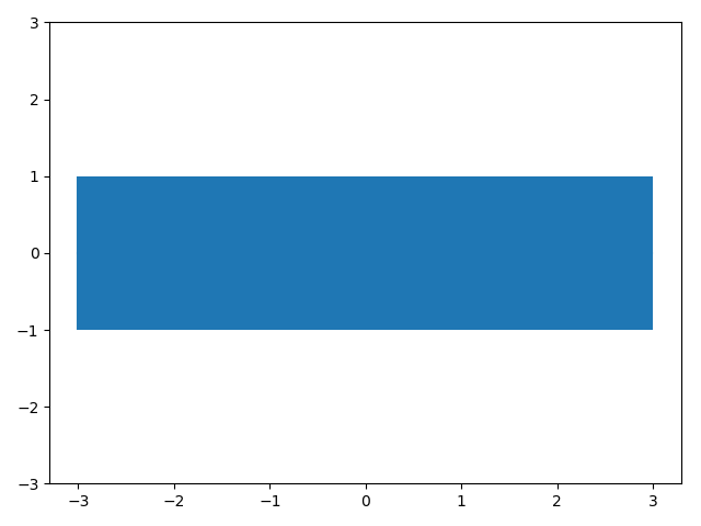
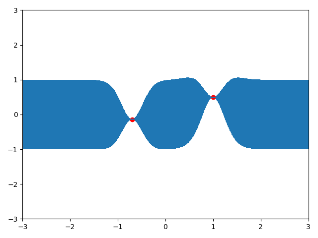
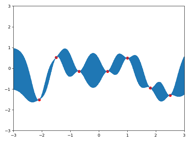
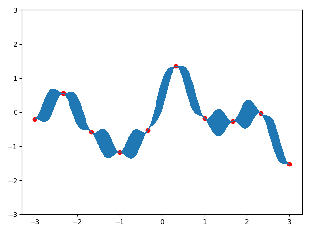
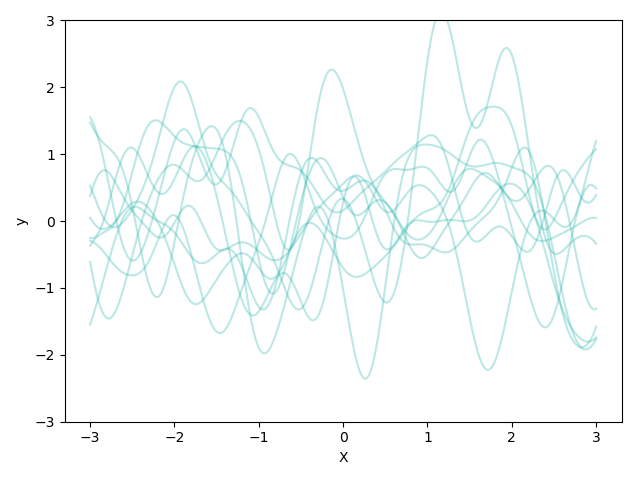
现在假设我们有一个观测点$(0,0)$,那么我们根据该点画出高斯过程先验
|
|
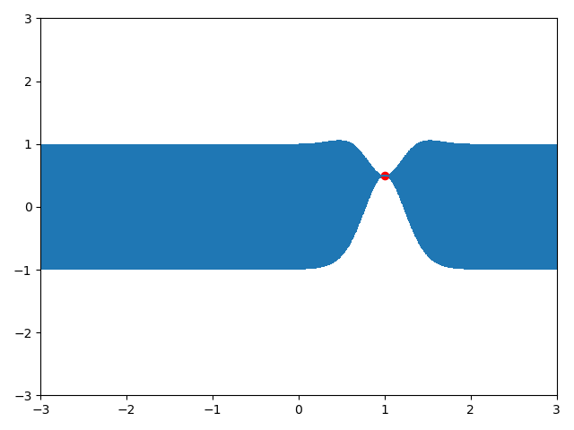
现在,假设我们有一个已知点$(x=1.0,y=0.4967141530112327)$,那么我们就根据这个点取预测新样本的值,即计算出正态分布的均值和方差,然后采样即可。
|
|
|
|
|
|
|
|
|
|
GPR中的参数选择
GPR on CO2 data
题意
该问题意在求解出$CO_2$含量关于时间的函数。
Density Estimation
[ref1] [ref2] [wiki] [sklearn-implement]
[Begin] [deepen] [deepen] [close to totally] [closer] [sjtu] [intuition] [形象生动]
核密度估计方法,是概率论中用来估计未知的(概率)密度函数,属于非参数检验方法之一,不利用有关数据分布的先验知识,对数据分布不附加任何假定,是一种从数据样本本身出发研究数据分布特征的方法。
问题分析
由给定样本集合求解随机变量的分布密度函数问题是概率统计学的基本问题之一。解决这一问题的方法包括参数估计和非参数估计。
对于参数估计,假设$(x_1,x_2,…,x_n)$是一组独立同分布的样本点,我们想要估计该组样本点的概率密度函数$f$。我们会假设样本点服从某一分布,比如高斯分布$x\sim N(\mu,\sigma ^2)$。 那么我们可以通过样本点取求解两个未知参数:
而非参数估计,核密度估计为:
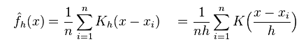
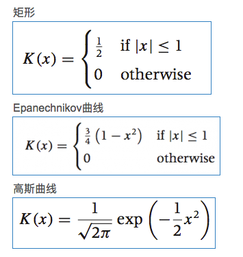
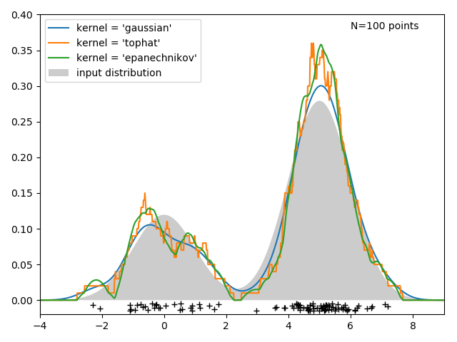
核密度函数的好坏依赖于核函数和宽带$h$的选择,但是$h$对密度的估计影响比核函数选取大。通常我们考虑核函数为关于原点对称的且其积分为1.常见的核函数。
Intuition:
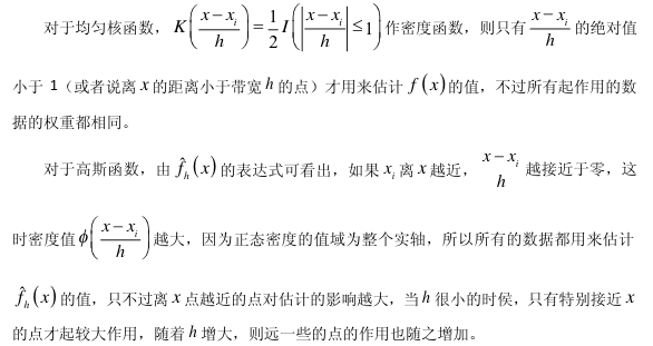
这些核函数存在共同点:在数据点处为波峰;曲线下方面积为1 ;故理解为在每一个样本点$x_i$都放置了一个高斯核,该核以$x_i$为轴对称。
在“非参数估计”的语境下,“核”是一个函数,用来提供权重。上式就是一个加权平均,离$x$越近的$x_i$其权重越高。在每一个样本点处都放了一个核函数;
核密度函数的原理比较简单,在我们知道某一事物的概率分布的情况下,如果某一个数在观察中出现了,我们可以认为这个数的概率密度很大,和这个数比较近的数的概率密度也会比较大,而那些离这个数远的数的概率密度会比较小。
基于这种想法,针对观察中的第一个数,我们可以用K去拟合我们想象中的那个远小近大概率密度。对每一个观察数拟合出的多个概率密度分布函数,取平均。如果某些数是比较重要的,则可以取加权平均。需要说明的一点是,核密度的估计并不是找到真正的分布函数。
带宽的理解:随着点距离的增大,即$(x-x_i)$增大,核函数愈小,并且当距离大于带宽$h$时,核函数接近0。
推导
概率分布函数是描述随机变量取值分布规律的数学表示。对于任何实数x,事件[X<x]的概率是一个x的函数:$F(x)=P(X\le x)$。
概率密度函数(Probability Density Function)是概率分布函数的一阶导数,
暂时不谈概率密度,我们从概率分布说起,因为概率分布导数就是密度函数。对于一个点,它的概率是$P(X=x_i)=\frac{# x_i}{N}$, 即它出现的次数与点总数的商。
直方图。 将数据值所在范围分成若干个区间,然后在图上描画每个区间中数据点的个数。
分布函数的一阶导数。
密度函数,从其定义出发,是分布函数的一阶导数。那么自然的,对于给定的样本集,我们通过估计其分布函数,然后对其求导得到密度函数。一个最简单而有效的估计分布函数的方法是所谓的「经验分布函数(empirical distribution function」:
$\hat{F_n}(t)$的估计为所有小于t的样本的概率。但是这个EDF是不可导的,不能直接求一阶导数得到密度函数。
密度函数可以记为:
我们把分布函数用上面的经验分布函数替代,那么上式分子上就是落在[x-h,x+h]区间的点的个数。我们可以把f(x)的估计写成:

面的这个估计看起来还可以,但是还不够好,得到的密度函数不是光滑的。如果记$K_0(t)=\frac{1}{2}\cdot 1(t<1)$,则


那么一个自然的想法是,我们是不是可以换其他的函数形式呢?比如其他的分布的密度函数作为K?如果我们使用标准正态分布的密度函数作为K,那估计就变成了:

由高斯积分$\int_{-\infin}^{+\infin}e^{-x^2}dx=\sqrt{\pi}$,上述积分$\int_{-\infin}^{+\infin}\hat{f_h}(x)dx=\frac{1}{\sqrt{2\pi}}\int_{-\infin}^{+\infin}e^{-x^2/2}dx=1$
h的选择
如何选定核函数的“方差”呢?这其实是由带宽h来决定,不同的带宽下的核函数估计结果差异很大。
如果是高斯核,令$\sigma$为样本方差,那么$h=(\frac{4}{3n})^{\frac{1}{5}}\sigma$.
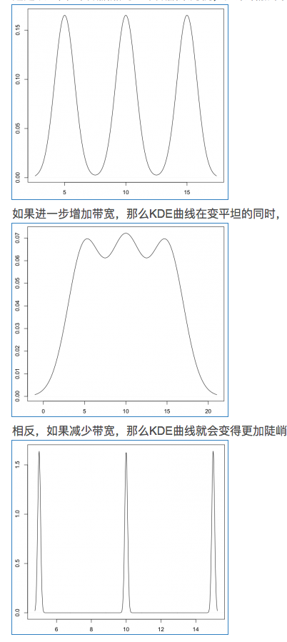
带宽反映了KDE曲线整体的平坦程度,也即观察到的数据点在KDE曲线形成过程中所占的比重。带宽越大,观察到的数据点在最终形成的曲线形状中所占比重越小,KDE整体曲线就越平坦;带宽越小,观察到的数据点在最终形成的曲线形状中所占比重越大,KDE整体曲线就越陡峭。
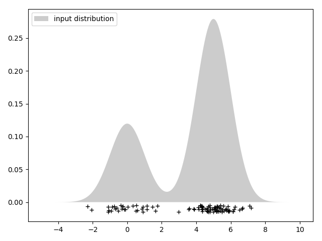
假设有3个数据,生成的KDE曲线如下:
K函数内部的h分母用于调整KDE曲线的宽幅,而K函数外部的h分母则用于保证曲线下方的面积符合KDE的规则(KDE曲线下方面积和为1)。
带宽的选择很大程度上取决于主观判断:如果认为真实的概率分布曲线是比较平坦的,那么就选择较大的带宽;相反,如果认为真实的概率分布曲线是比较陡峭的,那么就选择较小的带宽。
如果带宽不是固定的,其变化取决于估计的位置(balloon estimator)或样本点(逐点估计pointwise estimator),由此可以产产生一个非常强大的方法称为自适应或可变带宽核密度估计。
Python Implement
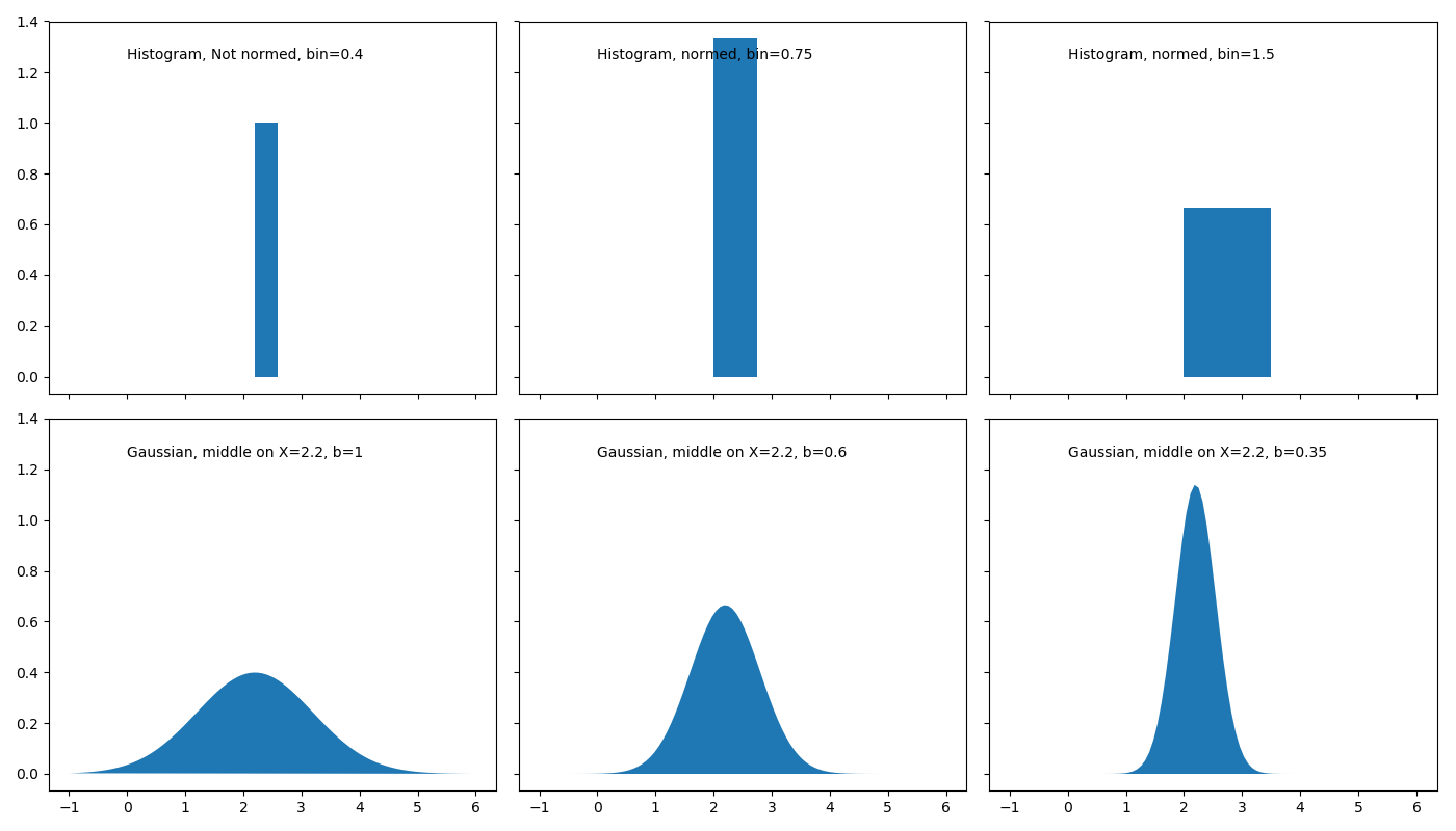
One data point example
|
|
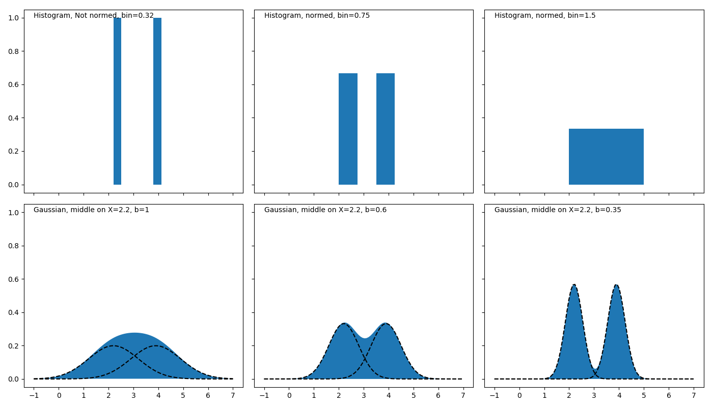
Two data point example.
|
|
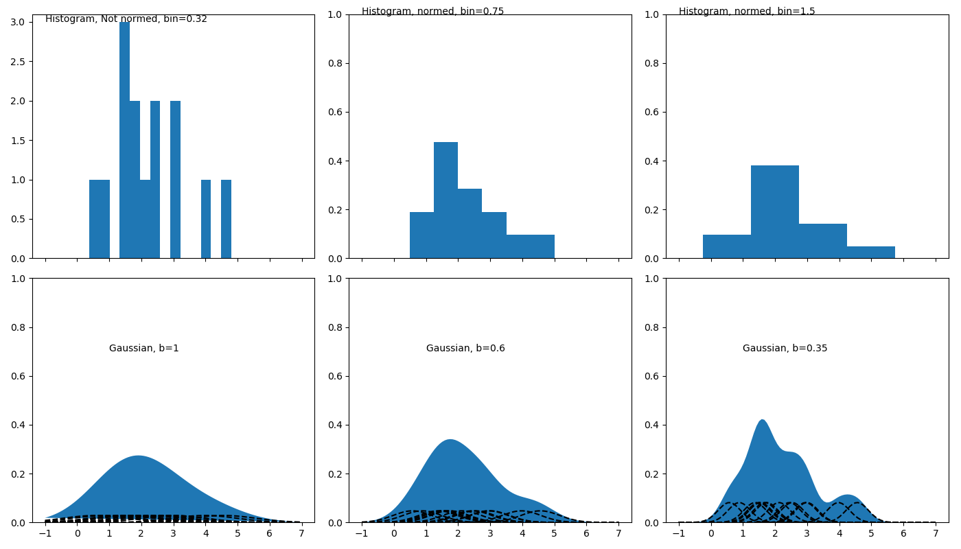
Multiple data points example
|
|
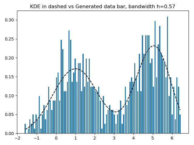
给定样本数据集,预测其密度函数,并使用预测的密度函数生成样本
|
|
3、Python.sklaern工具包
sklearn.neighbors.KernelDensity实现了核密度估计,类声明如下:
|
|
- bandwidth:核带宽
- kernel:’gaussian’ , ‘tophat’ , ‘epanechnikov’ , ‘exponential’ , ‘linear’ , ‘cosine’. 默认’gaussian’
方法
fit(X): 观测样本, X是二维的, shape = ( m , n )
score_samples(X):对观测样本的概率取以e为底的对数
Simple 1D Kernel Density Estimation
|
|
|
|
|
|
|
|
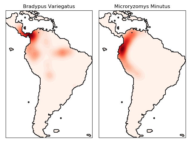
物种分布密度拟合
|
|
|
|