Principal Component Analysis

机器学习中,在高维情形下出现的数据样本稀疏、距离计算困难等问题,被称为“维数灾难”(curse of dimensionality)。而缓解该问题的一个重要途径是降维(dimension reduction),即通过某种数学变换将原始高维空间转换为一个低维“子空间”(subspace),在这个子空间中样本密度大幅度提高,距离计算也变得更加容易。

之所以可以进行降维,是因为在许多时候,人们观测或者收集到的数据样本虽然是高维的,但是与学习任务相关的也许仅仅是某个低维分布。

creen Shot 2018-10-24 at 12.56.10 PM-040380

成分数目选择

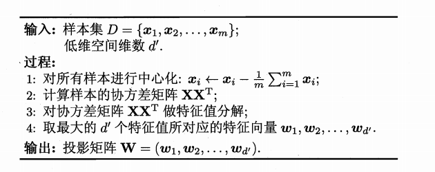
PCA降维一个重要的步骤是预先确定成分数目来描述数据,一种方法是计算cumulative explained variance ratio,

其中,$d$是原始数据维度,$d’$是数据降解之后的维度,$\lambda_i$是第$i$个特征值。

1
2
3
4
5
6
7
8
9
10
11
def component_number(self):
from sklearn.datasets import load_digits
digits = load_digits() # digits.data.shape=(1797, 64)
from sklearn.decomposition import PCA
pca = PCA()
component = [i for i in range(64)]
pca.fit(digits.data)
plt.plot(component,np.cumsum(pca.explained_variance_ratio_))
plt.xlabel("number of components")
plt.ylabel("cumulative explained variance")
plt.show()

mage-20181026192100

This curve quantifies how much of the total, 64-dimensional variance is contained within the first NN components. For example, we see that with the digits the first 10 components contain approximately 75% of the variance, while you need around 50 components to describe close to 100% of the variance.

Here we see that our two-dimensional projection loses a lot of information (as measured by the explained variance) and that we’d need about 20 components to retain 90% of the variance. Looking at this plot for a high-dimensional dataset can help you understand the level of redundancy present in multiple observations.

PCA from Scratch

1
2
3
4
5
6
7
8
9
10
11
12
13
14
15
16
17
18
19
20
21
22
23
24
25
26
27
28
29
30
31
32
33
34
35
36
37
38
39
40
41
def load_data(self):
self.data = pd.read_csv('testSet.txt',sep='\t',header=None,names=['x1','x2']).values
self.data = np.array(self.data)
self.ori_data = pd.read_csv('testSet.txt',sep='\t',header=None,names=['x1','x2']).values
def pca(self):
self.d = 1 # dimension after reduction
self.load_data()
row,col = self.data.shape
# Step 1: data centralization
col_sum = np.sum(self.data,axis=0)
col_mean = col_sum/row
self.data -= col_mean
# Step 2: calculating covariance matrix
cov = self.data.T.dot(self.data)
# Step 3: feature factorization
feature_val, feature_vec = np.linalg.eig(cov)
# Step 4: top n feature value and vector
sorted_eig = np.argsort(feature_val)
sorted_eig = sorted_eig[:-(self.d+1):-1] # pic d values from the end to the front
w = feature_vec[:,sorted_eig]
# Step 5: calculate low-dimension data
self.lowdim_data = self.data.dot(w)+col_mean
self.vis()
def vis(self):
x = self.ori_data[:,0] #(1000,2)
y = self.ori_data[:,1]
fig = plt.figure()
ax = fig.add_subplot(111)
ax.scatter(x, y)
x0 = self.lowdim_data[:, 0] #(1000,2)
y0 = self.lowdim_data[:, 1]
ax.scatter(x0, y0, marker='o', c='r')
plt.show()

mage-20181024141559

PCA Exploration

我们利用sklearn中的方法来探索pca,首先生成样本数据:
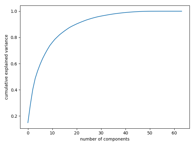
1
2
3
4
5
6
7
8
9
10
11
12
import numpy as np
import matplotlib.pyplot as plt
class PCA():
def visualize(self):
rng = np.random.RandomState(1)
# rng.rand(2,2) - sample 2*2 from uniform distribution
# rng.randn(2,200) - sample 2*200 from normal distribution
x = np.dot(rng.rand(2,2),rng.randn(2,200)).T # get 2*200 mixture sample
plt.scatter(x[:,0],x[:,1])
plt.axis('equal')
plt.show()

mage-20181020203014

明显的,xy存在类似线性的关系,但是不像线性回归去建模得到一个从xy的预测函数,PCA尝试学习xy的关系,这种关系是由一组特征向量和特征值表示:

1
2
3
4
5
6
7
8
9
def sk_pca(self):
from sklearn.decomposition import PCA
pca = PCA(n_components=2)
pca.fit(self.x)
print(pca.components_)
### [[ 0.94446029 0.32862557]
### [ 0.32862557 -0.94446029]]
print(pca.explained_variance_)
### [ 0.75871884 0.01838551]

其中pca.components_是特征向量,pca.explained_variance_是特征值。为了了解它们的意义,我们将之可视化:

1
2
3
4
5
6
7
8
9
10
11
12
13
14
15
16
17
def visualize_component(self,v0,v1):
ax = plt.gca()
arrowprops = dict(arrowstyle='->',linewidth=2)
ax.annotate('mean point',v1,v0,arrowprops=arrowprops) #x1是箭头的终点
def sk_pca(self):
rng = np.random.RandomState(1)
self.x = np.dot(rng.rand(2,2),rng.randn(2,200)).T # get 2*200 mixture sample
from sklearn.decomposition import PCA
pca = PCA(n_components=2)
pca.fit(self.x)
plt.scatter(self.x[:,0],self.x[:,1])
for length,vector in zip(pca.explained_variance_,pca.components_):
v = vector*3*np.sqrt(length)
self.visualize_component(pca.mean_,pca.mean_+v)
plt.show()

mage-20181025212330

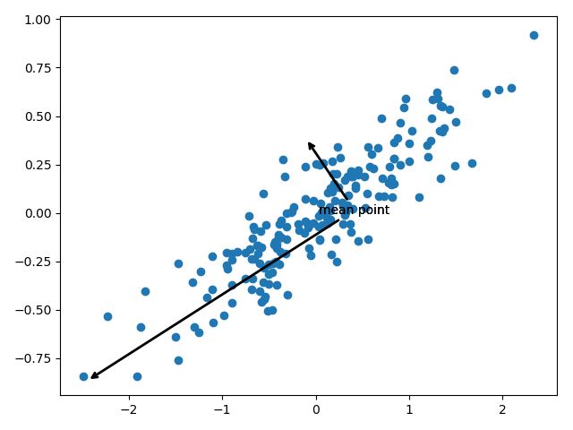
这些向量表征数据的主轴,而向量的长度描述了数据在该方向分布的重要性。

More precisely, it is a measure of the variance of the data when projected onto that axis. The projection of each data point onto the principal axes are the “principal components” of the data.

PCA in Dimension Reducation

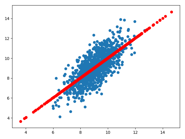
在维度削减中,PCA剔除一个或多个最小的主成分,使数据在低维上的映射尽可能保存数据的多样性。

1
2
3
4
5
6
7
8
9
def dim_reduction(self):
rng = np.random.RandomState(1)
x = np.dot(rng.rand(2, 2), rng.randn(2, 200)).T # get 2*200 mixture sample
from sklearn.decomposition import PCA
pca = PCA(n_components=1)
pca.fit(x)
x_pca = pca.transform(x)
print("original shape: ", x.shape) #original shape: (200, 2)
print("transformed shape:", x_pca.shape) #transformed shape: (200, 1)

数据被降维到1维空间,为了更加直观的理解降维效果,我们将降维后的数据还原到初始空间,

1
2
3
4
5
6
7
8
9
10
11
12
def dim_reduction(self):
rng = np.random.RandomState(1)
x = np.dot(rng.rand(2, 2), rng.randn(2, 200)).T # get 2*200 mixture sample
from sklearn.decomposition import PCA
pca = PCA(n_components=1)
pca.fit(x)
x_pca = pca.transform(x)
x_new = pca.inverse_transform(x_pca)
plt.scatter(x[:,0],x[:,1],label='original data')
plt.scatter(x_new[:,0],x_new[:,1],label='inverse data')
plt.legend()
plt.show()

mage-20181025214052

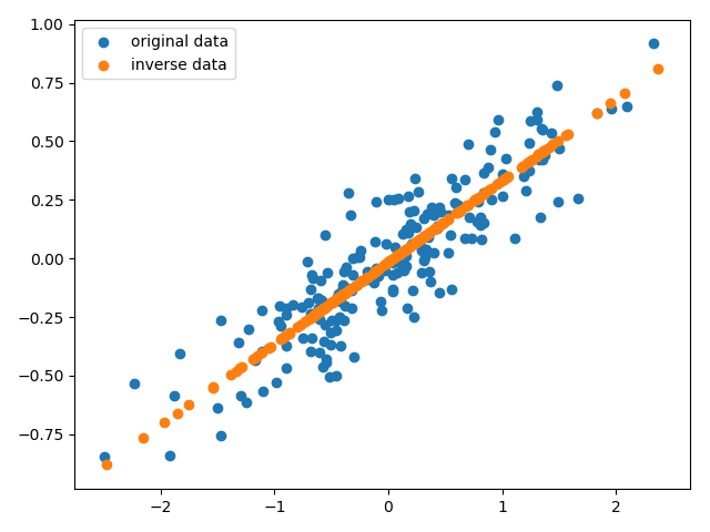
从图中可以看出PCA降维的原理:分布在比较不重要的轴的信息被移除,留下分布在重要轴的信息。

PCA for Visualization

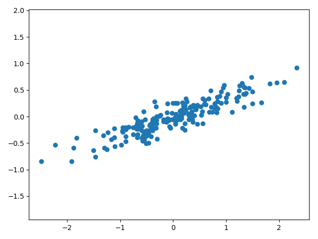
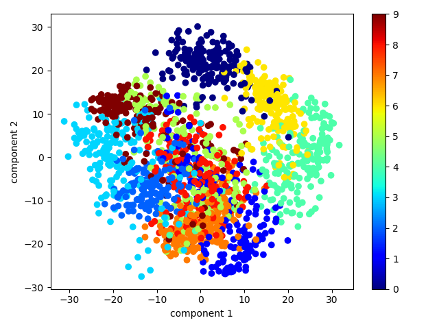
这一次我们使用高维的数据进行可视化,先载入数据:

1
2
from sklearn.datasets import load_digits
digits = load_digits() #digits.data.shape=(1797, 64)

手写体数字是8*8图片,故有64个维度,为了理解这些数据点之间的关系,我们将之降维到平面,即2维空间:

1
2
3
4
from sklearn.decomposition import PCA
pca = PCA(n_components=2)
pca.fit(digits.data)
projected = pca.transform(digits.data) #projected.shape = (1797, 2)

最终将它们可视化:

1
2
3
4
5
6
7
8
9
10
11
12
13
def vis_digits(self):
from sklearn.datasets import load_digits
digits = load_digits() #digits.data.shape=(1797, 64)
from sklearn.decomposition import PCA
pca = PCA(n_components=2)
pca.fit(digits.data)
projected = pca.transform(digits.data) #projected.shape = (1797, 2)
plt.scatter(projected[:,0],projected[:,1],
c=digits.target,cmap='jet')
plt.xlabel('component 1')
plt.ylabel('component 2')
plt.colorbar()
plt.show()

mage-20181026163242

PCA as Noise Filtering

PCA can also be used as a filtering approach for noisy data. The idea is this: any components with variance much larger than the effect of the noise should be relatively unaffected by the noise. So if you reconstruct the data using just the largest subset of principal components, you should be preferentially keeping the signal and throwing out the noise.

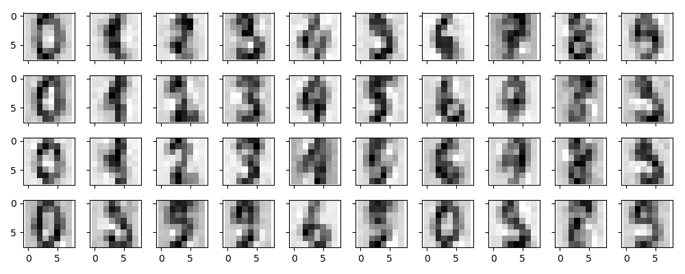
下面我们以手写体数字为例,探索PCA作为噪声过滤器的效果,首先我们画出无噪声的手写体数字:
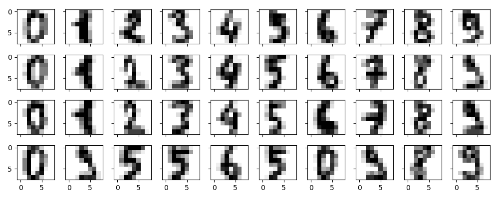
1
2
3
4
5
6
7
8
9
from sklearn.datasets import load_digits
digits = load_digits().data
def plot_digits(data):
fig,axes = plt.subplots(4,10,figsize=(10,4),sharex=True,sharey=True)
for i in range(4):
for j in range(10):
axes[i][j].imshow(data[i*10+j].reshape(8,8),cmap='binary')
plt.show()
plot_digits(digits)

mage-20181027222856

现在我们队手写体数字添加噪声:

1
2
3
np.random.seed(42)
noisy = np.random.normal(digits,4)
plot_digits(noisy)

mage-20181027223132

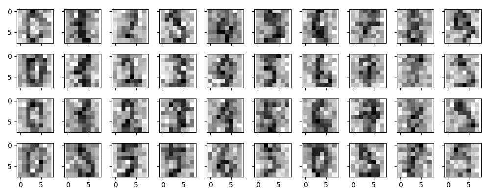
显然,添加了噪声的数据很难辨别,现在我们就去训练一个PCA进行去噪:

1
2
3
4
from sklearn.decomposition import PCA
pca = PCA(0.5)
pca.fit(noisy)
print(pca.n_components_) #12

我们想要模型解释至少50%的变化,根据模型显示,需要12个维度。

1
2
3
components = pca.transform(noisy)
filtered = pca.inverse_transform(components)
plot_digits(filtered)

mage-20181027223930

This signal preserving/noise filtering property makes PCA a very useful feature selection routine—for example, rather than training a classifier on very high-dimensional data, you might instead train the classifier on the lower-dimensional representation, which will automatically serve to filter out random noise in the inputs.

1
2
3
from sklearn.datasets import fetch_lfw_people
faces = fetch_lfw_people(min_faces_per_person=60)
print(faces.data.shape) #(1348, 2914)

可以看到每一张图片的维度是2941=62*47,由于数据维度比较大,这次我们使用RandomizedPCA而非标准PCA

In this case, it can be interesting to visualize the images associated with the first several principal components (these components are technically known as “eigenvectors,” so these types of images are often called “eigenfaces”). As you can see in this figure, they are as creepy as they sound:

1
2
3
4
5
6
7
from sklearn.decomposition import RandomizedPCA
pca = RandomizedPCA(150)
pca.fit(faces.data)
fig,axes = plt.subplots(3,8,figsize=(9,4),sharex=True,sharey=True)
for i,ax in enumerate(axes.flat):
ax.imshow(pca.components_[i].reshape(62,47),cmap='bone')
plt.show()

mage-20181027230748

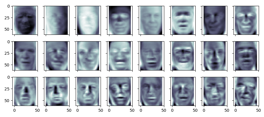
The results are very interesting, and give us insight into how the images vary: for example, the first few eigenfaces (from the top left) seem to be associated with the angle of lighting on the face, and later principal vectors seem to be picking out certain features, such as eyes, noses, and lips. Let’s take a look at the cumulative variance of these components to see how much of the data information the projection is preserving:

1
2
3
4
plt.plot(range(150),np.cumsum(pca.explained_variance_ratio_))
plt.xlabel('number of components')
plt.ylabel('cumulative explained variance')
plt.show()

mage-20181027231003

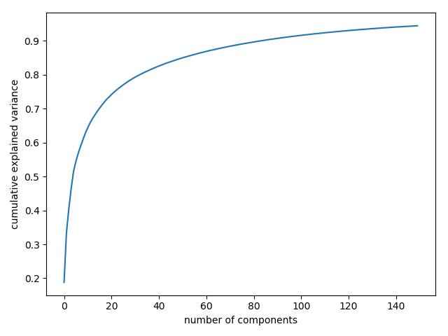
We see that these 150 components account for just over 90% of the variance. That would lead us to believe that using these 150 components, we would recover most of the essential characteristics of the data. To make this more concrete, we can compare the input images with the images reconstructed from these 150 components

1
2
3
4
5
6
7
8
9
10
11
12
components = pca.transform(faces.data)
projected = pca.inverse_transform(components)
fig, ax = plt.subplots(2, 10, figsize=(10, 2.5),
subplot_kw={'xticks': [], 'yticks': []},
gridspec_kw=dict(hspace=0.1, wspace=0.1))
for i in range(10):
ax[0, i].imshow(faces.data[i].reshape(62, 47), cmap='binary_r')
ax[1, i].imshow(projected[i].reshape(62, 47), cmap='binary_r')
ax[0, 0].set_ylabel('full-dim\ninput')
ax[1, 0].set_ylabel('150-dim\nreconstruction')
plt.show()

mage-20181027231140