A high-level plotting library built on top of matplotlab. Seaborn helps resolve the two major problems faced by Matplotlib; the problems are:
- Default Matplotlib parameters
- Working with data frames
Seaborn Quick Guide
Dataset
|
|
|
|
Figure Aesthetic
Basically, Seaborn splits the Matplotlib parameters into two groups−
- Plot styles
- Plot scale
Figure style
Seaborn provides five preset themes: white grid, dark grid, white, dark, and ticks. The interface for manipulating the styles is set_style().
Background
Darkgrid
It is the default one.
|
|
whitegrid
|
|
dark
|
|
white
ticks
Axes
Remove axes spines
You can call despine function to remove them:
|
|
You can also control which spines are removed with additional arguments to despine:
Scaling plot elements
We also have control on the plot elements and can control the scale of plot using the set_context() function. We have four preset templates for contexts, based on relative size, the contexts are named as follows
- Paper
- Notebook
- Talk
- Poster
By default, context is set to notebook;
Color Palette
Seaborn provides a function called color_palette(), which can be used to give colors to plots and adding more aesthetic value to it.
|
|
Return refers to the list of RGB tuples. Following are the readily available Seaborn palettes −
- Deep
- Muted
- Bright
- Pastel
- Dark
- Colorblind
Qualitative Color Palettes
Qualitative or categorical palettes are best suitable to plot the categorical data.
|
|
Here, the palplot() is used to plot the array of colors horizontally.
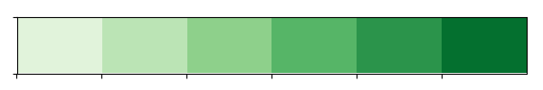
Sequential Color Palettes
Sequential plots are suitable to express the distribution of data ranging from relative lower values to higher values within a range.
Appending an additional character ‘s’ to the color passed to the color parameter will plot the Sequential plot.
|
|
Diverging Color Palette
Figures
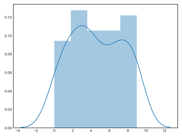
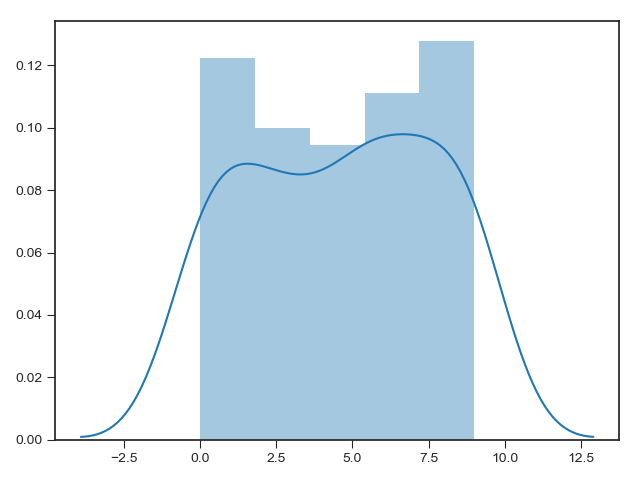
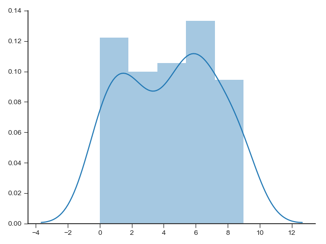
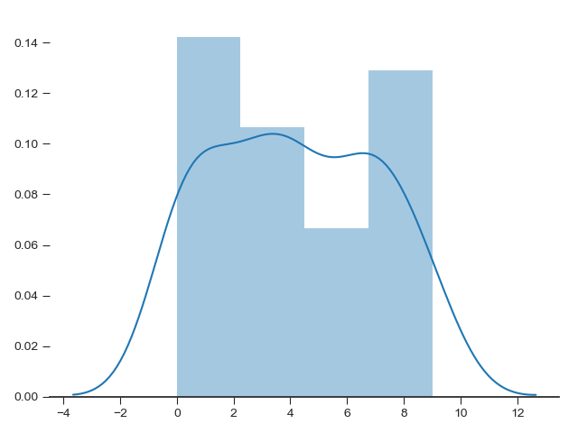
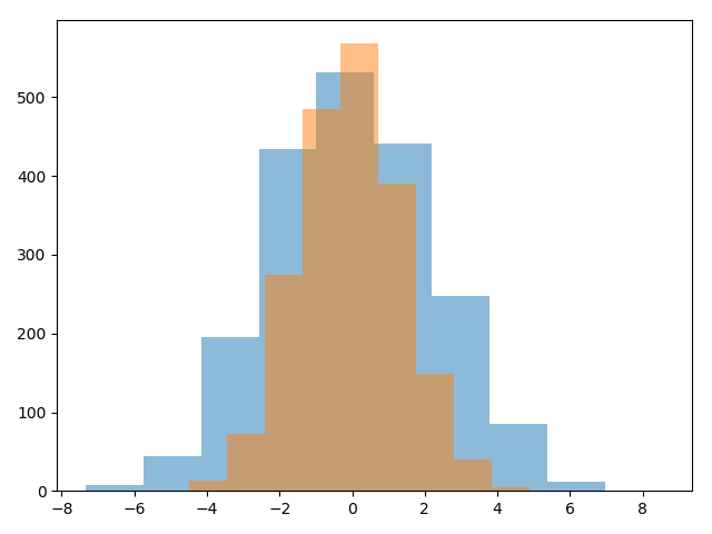
Histograms, KDE, and densities
In matplotlib,
|
|
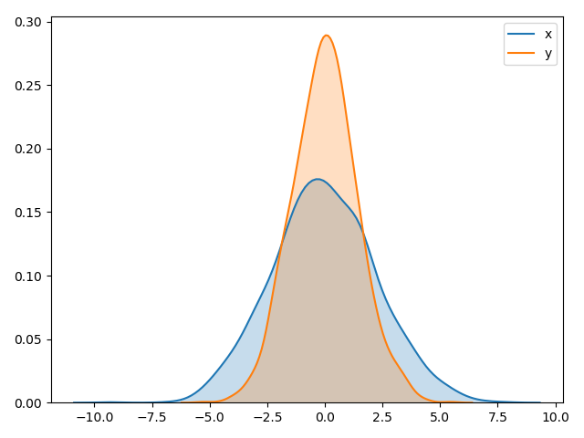
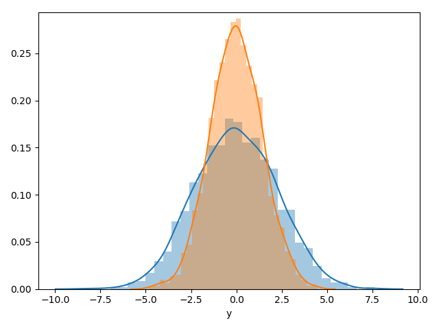
Rather than a histogram, we can get a smooth estimate of the distribution using a kernel density estimation, which Seaborn does with sns.kdeplot:
|
|
Histograms and KDE can be combined using distplot:
|
|
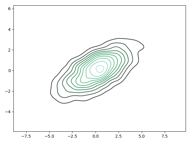
If we pass the full two-dimensional dataset to kdeplot, we will get a two-dimensional visualization of the data:
|
|
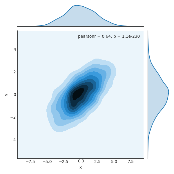
We can see the joint distribution and the marginal distributions together using sns.jointplot. For this plot, we’ll set the style to a white background:
|
|
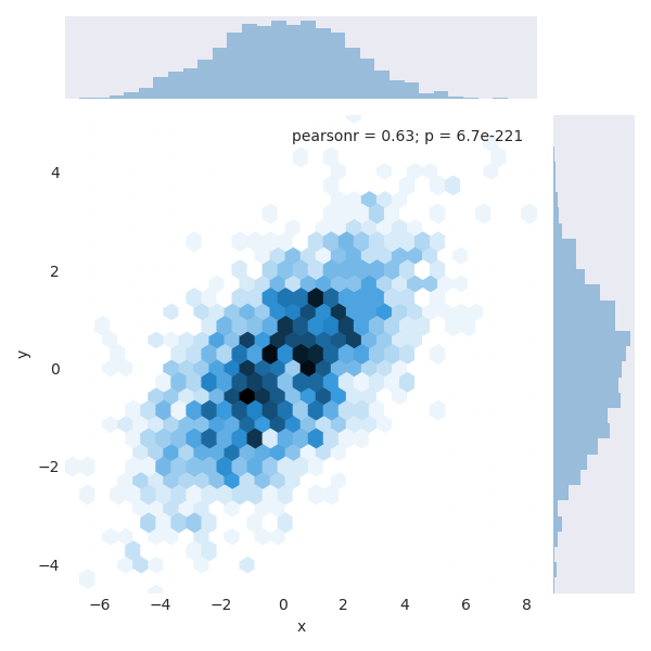
There are other parameters that can be passed to jointplot—for example, we can use a hexagonally based histogram instead:
|
|
Pairwise plots
When you generalize joint plots to datasets of larger dimensions, you end up with pair plots. This is very useful for exploring correlations between multidimensional data, when you’d like to plot all pairs of values against each other.
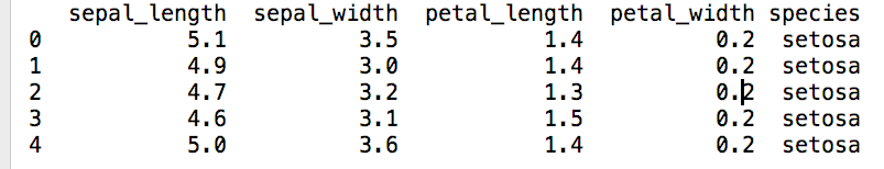
We’ll demo this with the well-known Iris dataset, which lists measurements of petals and sepals of three iris species:
|
|
Visualizing the multidimensional relationships among the samples is as easy as calling sns.pairplot:
|
|
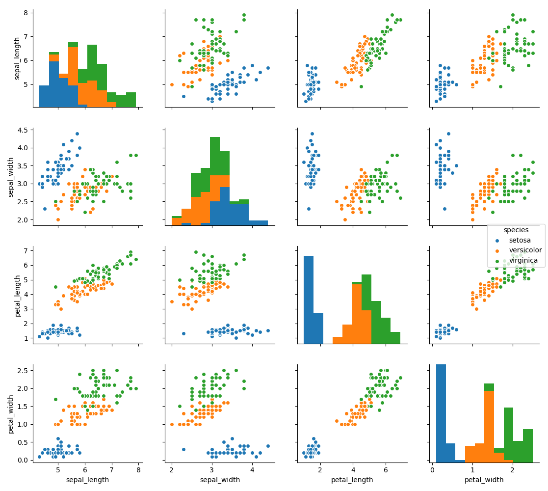
We can see that if we want to do classification, we can use petal_width and petal_length because from figure 15, these three species are distinguished.
categorical data
stripplot()
stripplot() is used when one of the variable under study is categorical. It represents the data in sorted order along any one of the axis.
|
|
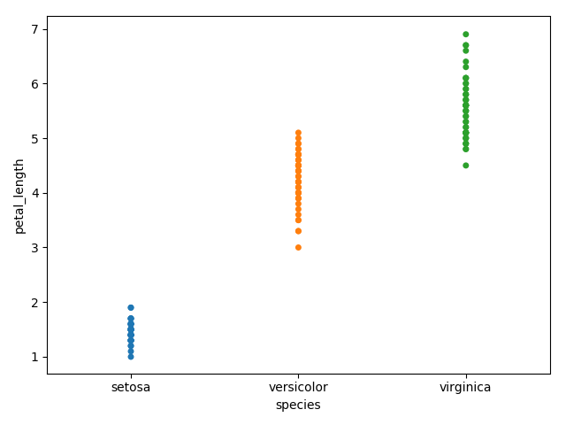
In the above plot, we can clearly see the difference of petal_length in each species. But, the major problem with the above scatter plot is that the points on the scatter plot are overlapped. We use the ‘Jitter’ parameter to handle this kind of scenario.
Jitter adds some random noise to the data. This parameter will adjust the positions along the categorical axis.
|
|
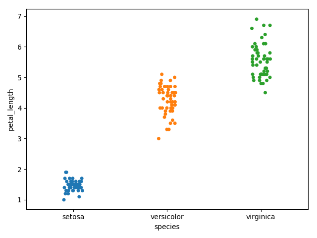
We can see that the x-axis of point is changed but not y_axis. So that we can see the petal_length of each point without any overlay.
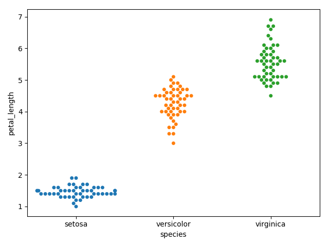
swarmplot()
Another option which can be used as an alternate to ‘Jitter’ is function swarmplot(). This function positions each point of scatter plot on the categorical axis and thereby avoids overlapping points
|
|
Distribution of observations
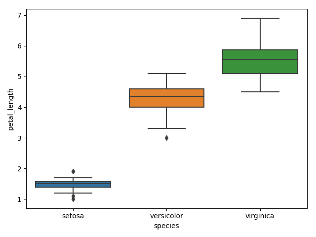
boxplot()
|
|
violinplot()
Violin Plots are a combination of the box plot with the kernel density estimates. So, these plots are easier to analyze and understand the distribution of the data.
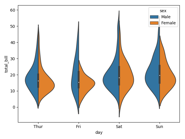
Let us use tips dataset called to learn more into violin plots. This dataset contains the information related to the tips given by the customers in a restaurant.
|
|
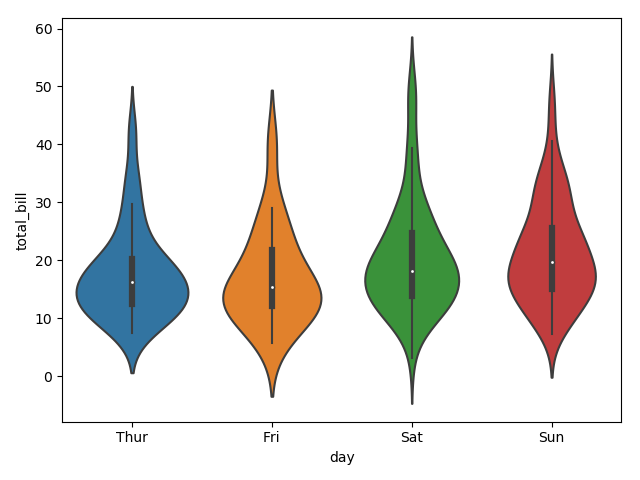
The quartile and whisker values from the boxplot are shown inside the violin. As the violin plot uses KDE, the wider portion of violin indicates the higher density and narrow region represents relatively lower density. The Inter-Quartile range in boxplot and higher density portion in kde fall in the same region of each category of violin plot.
The above plot shows the distribution of total_bill on four days of the week. But, in addition to that, if we want to see how the distribution behaves with respect to sex, lets explore it in below example.
|
|
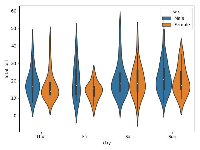
Now we can clearly see the spending behavior between male and female. We can easily say that, men make more bill than women by looking at the plot.
And, if the hue variable has only two classes, we can beautify the plot by splitting each violin into two instead of two violins on a given day. Either parts of the violin refer to each class in the hue variable.
|
|